About TrueCountrySize
See the world
as it really is.
TrueCountrySize helps you compare the real size of countries, states, provinces, and regions by letting you move them across the map.
Our Mission
Make geography easier to understand.
Many world maps distort size, especially near the poles. This site turns that distortion into something you can see, drag, and compare.
Interactive Maps
Drag countries and regions around the world.
True Perspective
Understand how map projections distort size.
Regions Included
Compare countries, states, provinces, and major regions.
Country Data
Explore economy, geography, population, and general info.
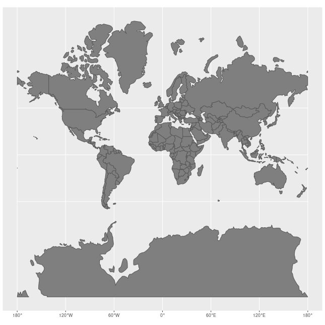
How Maps Work
Why Mercator distorts size.
Most online maps use the Mercator projection. It preserves local shapes and angles, which made it useful for navigation, but it stretches land more and more as you move away from the equator.
Near the poles, this stretching becomes extreme. That is why Greenland can appear close in size to Africa on many maps, even though Africa is much larger in real land area.
Mercator projection animation by Jakub Nowosad, via Wikimedia Commons. Licensed under CC BY-SA 4.0.
More Than Size
Country information in one place.
TrueCountrySize is also built as a country information hub, with useful data about economies, geography, governments, population, and more.
Economy
GDP, GDP per capita, imports/exports, inflation, and unemployment.
Geography
Area, borders, and coastline.
General Info
Capital, population, and density.
Explore the world clearly.
Start comparing countries, regions, and real-world size.